I like DoorDash and have used them for a few years, across many cities (I travel often, I’m not sure what their analysis makes of the various places I’ve ordered from).
What’s amusing is that my home in Las Vegas is one of many where the routing algorithm used for their drivers takes them to the wrong place every single time. I’ve updated my delivery directions to include the cross streets that bracket my condo, but it never helps.
A driver finally showed me why … and it’s a classic example of either bad analysis or bad design in the UX.
The Driver Interface
A DoorDash driver (a dasher) is given a route which they’re supposed to follow. They are tracked, of course, and their location shown on the map in the customer interface (next section I’ll talk about THAT fiasco).
Until the driver arrives where the GPS sends them, the customer’s “delivery directions” are not shown.
Think about that statement for a minute. Let it percolate …
The driver is forbidden to read the very directions that the customers provide for helping them successfully deliver to their customers until after they have arrived at a place that may be (and in my case is every time) the wrong place!
Dashers have asked for the directions to be shown to them at the start of their trip. They’ve told me “DoorDash doesn’t listen to us.” I believe it. I offered to help them … this is my help. I like DoorDash, I like the dashers, and I’d really like to get my food on time without watching them go to a dirt road from my balcony.
What is the mistake? It’s a mistake in usability. I can almost hear the development team discussing the user story, probably written something like this: The customer has a special delivery option like a gated entrance or Ring doorbell, so allow them to give a freeform delivery note and make it available to the dasher.
So, because technical people often try to optimize (the root of many mistakes!) things, here’s how I suspect the discussion went: “Hey, we should avoid bothering the dasher with this until they reach the destination, since they’re busy driving and shouldn’t be handling their device anyway!” “Yeah, it’s not like delivery instructions matter before they arrive!”
And so, the decision was made. The bad decision.
The decision assumed the following:
- The routing from restaurant to delivery address is always perfect (BAD ASSUMPTION — the route to my address is always wrong)
- No delivery instructions ever affect the routing (BAD ASSUMPTION — could be many gates on different streets and only one of them can be used by the tenant!)
Mistakes like this are easy to make. When I worked with ADP they sent us developers out to do “Payroll Observations” so we’d see real payroll experts using our software to process payroll. It was an eye opener. They were avoiding this sort of mistake!
I have to wonder, did DoorDash ever send its developers out with dashers (or have them dash for a week!) to understand what was needed from the perspective of the dasher?
Even if yes — the frustration the dashers I’ve spoken with about their request to see the delivery instructions earlier being ignored was palpable.
I know, I’m old school — but I really believe its the responsibility of the developers to serve the audience. In this case, the dasher audience is being harmed, and has been for years. It makes them late and wastes their time, which annoys the customers and reduces their income.
Now, the Customer Experience Waiting for the Dasher is Broken Too!
Now, here’s what the Door Dash interface looks like for me when I’m waiting on a dasher (note: I shifted it away from my house to show a random place):
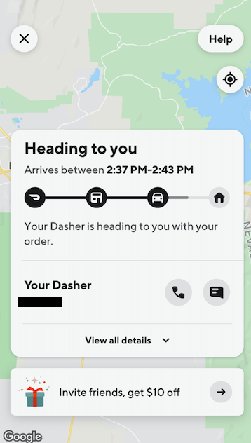
The Google map shows where the dasher is, where the pickup is, and where the delivery is. Of course, that’s not visible here, because I moved the map underneath that giant display of “Heading to you.”
Now, had I not moved it, all I’d be able to see is the destination, because almost 80% of the screen is filled with the status window and the invitation window. Of course, I could zoom and scroll to get “where the dasher is” to fit in that little tiny space on top … but that’s clunky.
If the “View all details” is selected, the presentation box fills everything, effectively hiding the map. Reasonable. I can see more or limited.
Why is the application not allowing me, the user, to decide to see the whole map though? Why does DoorDash decide to make the map operational but hide most of it, just teasing me?
It would be consistent with UX design to allow the “Heading to you” to be shrunk to a line at the bottom, for instance. A choice like “See map” with a down-arrow similar to the “View all details.” That would give me, the customer, the ability to choose how much or little I wished to see.
I can understand the desire not to hide the “Invite friends” advertising marker. But, it’s my screen and I shouldn’t have to see the advertisement after I’ve decided I’m not going to invite friends this time. Allow me to close it. Even popup ads from the 90s allowed them to be closed (or the honest ones did). I’m already a customer. Treat me with a bit of respect!
Again, the needs of the audience aren’t being addressed. The reason for the map is to show the dasher’s location — that was well done. It shows that “Hey, it would be nice for the customer to know how far away their food is!” was listened to. Then … it was disregarded.
I don’t know why they chose the status view to always overlay the map. I only know it’s frustrating.
Customer Service Fiasco
I actually went to their help button to ask “Is there a way to hide the “Heading to you” box so I can see the whole map?
It was one of the most amazing customer service experiences I ever got. I was given a pre-written response “We’re sorry your dasher is late, have a $10 discount.” The dasher wasn’t late! I would hate to have them ding the dasher.
I said, “The dasher isn’t late.” They gave me another pre-written response, again not related to anything I’d said. I finally asked, “Are you human?”
There was a pause, and a poorly typed response “im human.”
What was happening? They have a call center somewhere with canned templated responses and the people weren’t actually paying attention to what was asked at all.
So, I went online and tried the help there. I misspelled my name as “BRian” and sure enough, the templates picked up that misspelling in every response. Someone made a policy “The customer will feel better about the canned response if their name is included” and they setup the templates to include it. How nice to know that they cared so much!
I fought my way through templates and eventually gave up.
It’s not just that the Dashers input and suggestions go unheeded — the attempt for a customer to make any but a predefined request goes unheeded as well.
How Not To Do This?
It’s odd, but … today, the idea that humans should interact with humans is almost anathema. I routinely use non sequitur statements, intentional misspellings, and other tricks to check for humanity. It’s amazing how often those trivial “Turing tests” show lack of humanity. Even when there are humans!
Today, humans can’t pass Turing tests because they’re required to act like bots. To make things efficient, we either replace humans, or we make them into mechanical turks that click the “prepared response to problem X” link on their screen.
That leads to people who don’t really understand the product or service well enough to answer anything that wasn’t prepared for. In the best cases, they send the question up to someone that’s permitted to think and go off-script. In the worst case, they just repeat the same thing until you give up.
I expect this from telemarketers. Those are sweat-shops with scripts. I routinely take them off their scripts just to see how long they last before they hang up, with them doggedly trying to get back on-script. They are cold-calling me and so are fair game.
But when a customer contacts support, there is supposed to be a relationship. I want the vendor to do well, and I want to remain a customer. The vendor wants to do well and wants me to remain a customer. This is classic alignment.
But I’m not feeling like a customer as often these days. I’m feeling like an irritant that’s to be handed off to a machine … or a person not allowed to do more than act like one.
Contrast that to the excellent support I’ve gotten from smaller companies. Even when they can’t help me, they have humans responding. Often, I’ve been surprised to learn I was interacting with the founder or a senior person — pleasantly surprised.
A Plea!
Please allow humans to work with humans.
The unending phone menu trees (I now just press zero or say “operator” until the computer gives up), the “chat buttons” on websites that go to bots that aren’t able to answer anything but stock questions. The humans who pick up where the bots fail and aren’t allowed to do more than the bots did …
Sure, it costs money to provide customer service. I’m not asking for the CEO to answer each call. Mostly, I’m asking for the people who do provide the service to be allowed to do so.
And the best way to reduce customer service costs is to ensure the customer’s wishes are served, which requires doing what the customer wants which requires knowing what the customer wants. Know it, not assume it and definitely not dictate it.
And when the people working in customer support are reached — make sure they are both able and allowed to do what is needed.
Please?
Keep the Light,
Otter
Brian Jones
